I’ve designed a lot of logos over the years. I follow logo designs from major Fortune 500 companies. Here’s what I know. Your logo, much like fashion, can get dated quickly, if you’re not careful. It needs to be designed with your audience \ target market in mind. So if they change, eventually you logo will need to follow suit. Also, make sure you tell your graphic designer how your logo will be used. Is it going to be on a sign? Will it be on your business cards and brochures? Do you need to use it on product packaging? Something small like a postage stamp? This all makes a big difference in the type of design you will get. Make sure this logo, much like a suit or little black dress, will last you well into the future. Let’s take a look at some logo re-designs from major companies. We can see what they did and some possible (or reported) reasons why they chose to overhaul their logo.
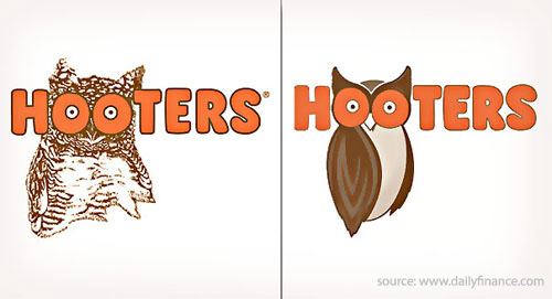
Case #1: Hooters
Disclaimer: Yes, I know not everyone’s taste. I’m not making a statement on that. I’m looking at their logo from a business and design perspective.What they did:
-They’ve kept their color scheme of white, brown and orange.
-The double entendre remains in place.
-The owl itself has changed. Less feather detail; more cartoon like.
-Shows off more of the owl’s wing and body instead of just a head-shot.
Why:
-New competition from other restaurants with similar theme.
-A change in target market.
-The updated logo is a sign of the updated stores, menu, and the potential change in staff uniforms.
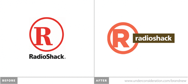
Case #2: Radio Shack
What they did:
-Kept their mostly text logo with the circle and capital “R”.
-Color scheme went from deep red and black to lighter red, brown, and white.
-Moved position of text from under circle to next to circle which is more modern.
-Changed capitalization of text to no capital letters at all which is on trend and modern.
-Circle appears smaller; Capital “R” in circle is now sans serif, also more modern.
-Reduction of fonts from two (a serif “R” and sans-serif name plate) to one (no more serif “R” just the font from the name plate).
Why:
-Attract younger audience
-Move business away from competition
![]()
Case #3: Wendy’s
What they did:
-Major overhaul of logo
-Change font
-Remove descriptive text from logo. Now it’s just the brand name.
-Larger image redrawn and modernized.
-Remove red background and Victorian feel.
-Logo can be used with or with out nameplate text.
Why:
-Redefining brand as an upscale hamburger restaurant. (which means they are entering a new market with different competition and a different audience)
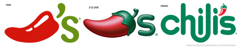
Case #4: Chili’s Restaurant
What they did:
-Created in 2011 and introduced slowly through 2012 for a seamless transition.
-Discontinued use of two logos, one with text and one with out.
-Flattened out non-text logo to more modern and less cartoon.
-Almost completely visual except for the “s”.
Why:
-Brand is growing- felt new logo was in order.
-Increase profits.
-Attract new customers in target market and retain current clientele.