As a graphic designer, I’ve created logos, but I also work with logos on a regular basis. Logos have stories, there is a reason why a businesses logo speaks to them and why it reflects their brand. I’ve collected few stories of how and why real business owners chose their logo. I’ve also included my professional takeaways to give you some insight into good points of each logo and points that may cause issues in future. Let’s meet some of my business owner friends and their logos!
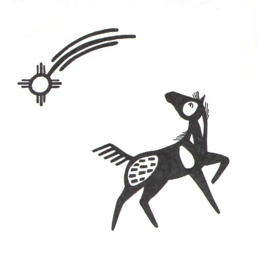 Lisa, Skyrock POA
This logo is very personal to me. I designed it myself, and if you look really closely you can see pen marks where it’s colored in – it’s actually a photo of the original drawing. Our little mini-business is breeding and showing POAs (Pony of the Americas), which are Appaloosa colored ponies. Since we started about 25 years ago, we’ve had several World and International champions, Regional and State champions that we’ve either shown or bred or both. Our ranch is called Skyrock POAs. I’m part Cherokee, and you can see that the logo is drawn in a Native Southwestern style. It has a spotted pony, and a shooting star, or a ‘sky rock’. A shooting star has meaning in many cultures, but I like the ‘wish upon a star’ element, meaning to fulfill your dream. We are small and on a shoe string, but the name has become well known across the country. So it combines 3 or 4 elements into one design and I feel it really represents us and what we do.
Designers Takeaways: “it combines 3 or 4 elements into one design and I feel it really represents us and what we do.” To me as a designer, that sentence is the one I want you to notice. This is what a logo should do at the end. It should combine multiple elements to create something that reflects you and your business. Reflecting you is important especially when you’re a small business like Skyrock POA or an individual agent /solo entrepreneuer.
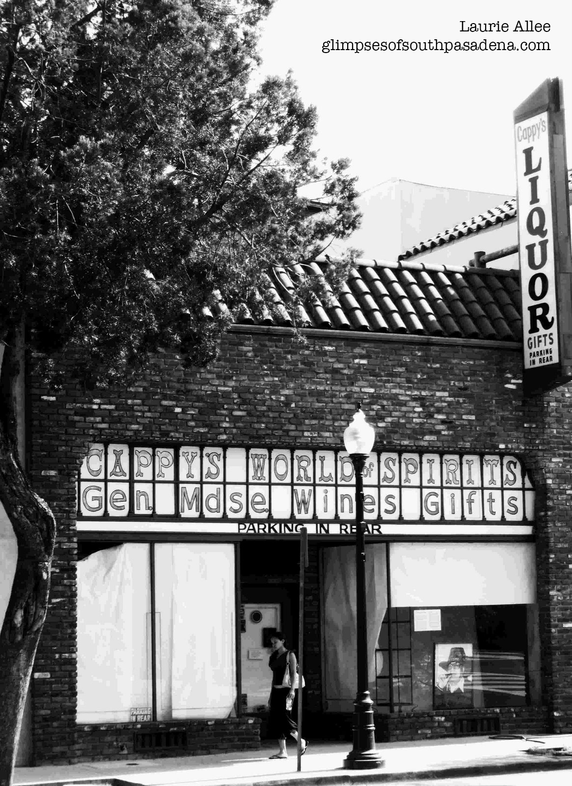 Holly, Cappy’s World of Spirits
My parents had a liquor store. The logo ended up being a world, Cappy’s World of Spirits, it started to be just Cappy’s, but when we were all working trying to set up the store my sister, Kathy, drew a world on a fabric sheet trying to have the feeling of all the different areas of the world where the liquor and wine came from. [I don’t know] if my parents were just humoring Kathy and using it at the time – it seemed to stick. We had world globes of all sizes in the store and people seemed to bring globes in and leave them. Cappy’s World of Spirits now just a ghostly store….
(**Note: I don’t have a copy of their logo, but I found a great photo of the store by photographer Laurie Allee on her blog Glimpses of South Pasadena**)
Designers Takeaways: Similar to SkyrockPOA, Cappy’s World of Spirits is also a family run business with a hand drawn logo. While I personally don’t have an issue with using a hand drawn logo created by the owners or their family, other designers might not be so accepting. Logos generally have a lot of research behind them. This research helps the logo do many things to help the business including positioning a brand in the marketplace, standing out from their competitors, and avoiding plagiarism among other things. One of the things that can happen if a logo is drawn with out this research behind it is a risk of accidental plagiarism, similar to what happened with the Rio Olympics and the Tokyo Olympics. Lastly, Businesses that choose to hand draw their own logo may need their logo created in a scalable digital format that works in many sizes for other items such as signage, websites, and promotional products.
On the positive side, I love that their logo, a globe or world, which is also part of the name of the business, reflects the décor of their shop. A brand is a lot more than a logo. Branding is about the décor of the business, the mission of the business and the service experience of the business’ customers. The logo is the visual representation of all of these traits.
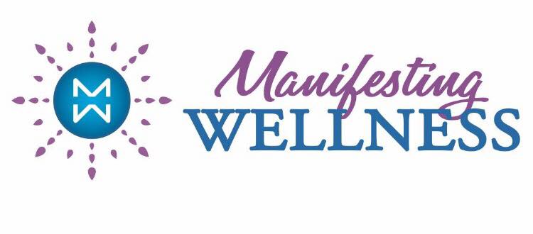 Kathleen, Manifesting Wellness
I started by writing down words I liked, words that felt connected to my purpose and the energy I wanted behind my brand. Then I asked people to tell me what makes me stand out, why they’d want to work with me over someone else. This generated a lot of descriptive words about me that I may not have thought of myself. Between those two activities, I had a long list of words and concepts to play with. Process of elimination and combining different words resulted in Manifesting Wellness because whether it’s teaching people about the benefits of essential oils or chemical-free living or empowering them with personal growth coaching, this is my desire for everyone…to manifest wellness in their lives. The colors are my two favorites; purple being my absolute favorite. My graphic artist came up with the design, with the idea of me spreading light to everyone as the image.
Designers Takeaways: I think this method is a great way to get started on not just a logo, but also naming a business. In Kathleen’s case, she’s an independent agent and her business name needed to reflect her as a person. For a business that starts off with more than one employee or is definitely something that might be scaled to include employees in the future, think about the purpose of the business and who its customers are or will be. Write down words based on the qualities of the business and what would attract their perfect customer.
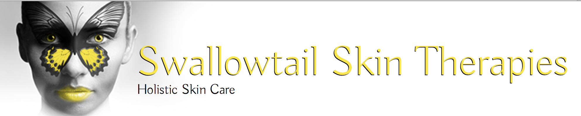 Elizabeth, Swallowtail Skin Therapies
I chose my logo when I was in Esthetician school. As part of the licensing requirement students were allowed to see clients through the school. Toward the end of the term, the instructors told us to create business cards and practice handing them out to clients. I had the image of a tree in my mind and Thrive. When I went on Vistaprint, I looked through images of trees and colors…nothing popped. Then I saw this image- BAM!!! The face was bold- only 2 strong colors- and a butterfly. In that moment I changed the name of business to Swallowtail Skin Therapies. Recently, Swallowtail butterflies appeared as answers to my prayers. It is a striking image and it owned by Vistaprint. For now it works, it gets my business noticed and I am remembered. In time, I may change it. And I am patient.
Designer’s Takeaway: It is pretty common for new businesses especially independent agents, “solopreneurs”, and the like to use template sites for their initial marketing materials from template sites. As a graphic designer in Orange County, I’ve seen countless business cards and logos from large template sites over the years. If you’re fresh out of school or want to test out your business concept and just get your feet under you, then sites like these are fine. Unfortunately, when a business uses logos and marketing materials from a template site they don’t own the designs, which means a rebrand and an investment in custom branding is in their future. Also, their chances for being confused with a competitor are higher than businesses that have made the investment in custom branding.
 Kristen, Full Circle Yoga
I have long been inspired by the Japanese enso, a perfect circle made with a single brush stroke in a state of meditation. As a yoga center I wanted what we do to be the largest and clearest word, and the enso in YOGA was the best place for our name: Full Circle. We played a bit with the placement of our name in relationship to the word YOGA, and decided that in the middle was best, even though some people say it “YOGA FULL CIRCLE.” 😉
We found a font with a brushy appearance, such as one would make with Japanese kanji. Full Circle is also a play on our company’s LLC and our family name: Fewel Circle. Here’s a little more about the history of how we chose the name Full Circle Yoga:
The name of our yoga studio came to me in a dream 15 years before its inception. Full Circle Yoga comes from the heart of the phrase “come full circle,”whose many meanings transcend culture, and provide an expectation of what a healing center should be. Healing centers should be a place of education and experience to help you to move along your path with guidance and care. But the transformation takes place when there is a point at which you feel differently about yourself and the connections you hadn’t made before. Some meanings and images of this phrase “Full Circle” that we associate with our healing center are embracement, inclusion, connection, perseverance, realization, and insight.
To come “full circle” also means having the perseverance to continue the path you know is right for you, and that it is something worth doing toward that end. If you are a seeker, and want to know more about the strength that’s in you, you have to be willing to dig in! If you are a natural healer, you can learn to channel that energy in a direction that furthers your life’s purpose, and to have your experiences with sometimes mystical and powerful energies validated. Coming full circle means you took an active part in this learning and growing process and came back better and stronger than ever. “Personal growth cannot be given or bought, but it can be modeled and taught!”
Designer Takeaway: This is a great story. It speaks to their brand, which again is a buisness’ décor, mission, and the feeling their customers have about them among other things. I think it was also a smart choice for them, marketing wise, to have what they do, yoga, larger than their name (despite that some people confuse the name). By doing this, it allows potential customers to know what they do in 10 seconds or less. I feel like their name inspired their mission rather than the other way around, but the best part is, that’s okay.
 Connie, Life Coaching
I love suns, I’ve just always been attracted them! I didn’t think to tell you that. I just gave you the word shiny and waited to see what you would come up with. I loved [my logo] then (when it was first finished) and I put it away for a while, but now, I took it out and looked at it and I still love it. It’s perfect.
Designers Takeaway: A past client told me the above logo story. I’m hoping I transcribed it correctly. What I think this story shows is the power of a designer. When a business owner uses a designer to create their logo, it’s the designer’s job to create something that reflects the business or the agent/coach even if they just provide a few words such as Shiny or Modern. A good logo also has staying power, it’s something that is liked and useable by the business when it’s first created, but also years down the road.
 Sandy, Catering On Time
I wanted a logo that represented class and fine dining. I wanted a white glove because that is the service I give to my clients. The tray is because we offer service at every level. Gold of the tray to reflect prestige. The line underneath Catering On Time, is to emphasize the company name. Your Party, Your Way, is to make sure people know we would like their experience is truly for them and their ideas for their party.
Designers Takeaway: I love how much thought went into each part of their logo. If someone has clear intent of what each portion of their logo should mean and how it will tie in with their business they need to clearly indicate that to their designer. A designer client relationship is built on trust and good two-way communication. When those things happen, a business gets a logo that fits their vision just as Catering on Time’s logo fits their vision and reflects their brand.
These are just a few stories of how and why real business owners chose their logo. I hope they’ve inspired you a little to choose a logo that reflects your company’s brand and all that a brand entails. There is no right way to create a logo, but it is in a business owner’s best interest to hire a professional graphic designer to help you. If you do need help with a logo find a graphic designer that you trust and feel you’ll share good communication with each other. Obviously, I hope you’ll consider Purple Rose Graphics and look forward to the honor of helping you grow your dream.