Maybe your company has grown a lot recently. Perhaps you just don’t like the logo you had at first, it doesn’t fit your vision. You’re actually a lot more specialized than your old logo makes you out to be or you just inherited the family business and want to modernize it. There are many reasons to re-do your logo, which for the sake of simplicity I’ll call a rebrand. True rebranding, however, has a lot of internal components and strategy overhauls that go into it.
There is a subtle art to the reimagining of logos, which as an Orange County, California based visual marketing specialist focused on graphic design is something I specialize in!
Older companies tend to like to rebrand often and in a subtle way as a means of keeping their image fresh to the public. This works because they have a fresh modern look without compromising their recognition factor with their existing audience. Other times, older companies rebrand to separate themselves from an image and mode of operation that may seem outdated. I’ve noticed this type of re-branding seems to happen when there has been a big technology shift in a certain industry, a specific company has new leadership, a company or industry is recovering from some type of bad for business image issue, or is rolling out some type of expanded or new product line. Whatever the reason, when an older well-established company rolls out a massive rebrand, people generally will notice. Businesses need to be careful with a rebrand like this because they can come across as a brand-new business and lose parts of their existing audience.
Case in point: This is one I did; the client wanted a subtle re-envisioning of their logo that could be modified as their product offerings expanded. The large block was subbed out for four smaller blocks as a play on the main part of the business name “quad coun
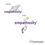
Sometimes a company just needs a full rebrand from the inside out and not just a visual make-over. This is a type of rebrand that I see a bit more often with companies that have a need to  express a certain type of image—reliable, creative, tough, durable…etc. It also seems to come about when the old logo seems to have very little, if anything, to do with the industry that the company is in. Sometimes these shifts occur due to outside factors such as technology, government regulations, or competition among others. Sometimes the logo just misses the mark by being to too generic. Other times this shift occurs naturally as a company matures into one product line and customer base and out of another product line and customer base, which is what happened with one of my clients.
Case in Point: They actually added a service to help both people and animals and because of that came to me to change their original logo, which I also did, to an updated version more reflective of their new product offerings at the time
The last common reason for a logo overhaul is because their current logo choice was considered legally compromised. I got taught in school that copying other people’s work is bad. Plagiarism is not something any of the designers I’ve met ever really wants to do. Personally, I have spent hours researching for a business’s logo design to make sure I’m aware of their industry trends, best practices, demographics, and other logos similar to what they have or requested in order to do my absolute best to avoid any type of copyright issues for my client. I happen to be a little more in-depth in the research I do, but most designers do at least some research when creating a logo for a client. This is part of the reason for the cost. Unfortunately, with so many millions of companies worldwide and certain themes being so popular, plagiarism can happen by accident. What one designer (or client) thinks is an inspired new idea can actually be something that looks uncomfortably similar to someone else’s work. Luckily, I haven’t had this issue yet!
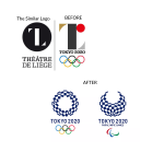
Case in Point: The Olympics have been plagued over the years with this issue. Most recently was the logo for the now-canceled 2020 games in Japan. Whether this was actually a case of  accidental plagiarism or not and what the outcome should be is for the legal system to decide. For my purposes here, it is being used to show how easy it can be to copy someone else’s work even when the designer and client don’t intend to do so.
Their original logo was meant to be modern and depict a large letter T made out of various shapes, unfortunately, it was way too similar to a logo for a theatre in Belgium. Similar enough that the designer for the theatre pursued legal action causing the Olympic committee to scrap the logo and select a new one. The final selection was meant to evoke a feeling of harmony and uses mathematical motifs in it.
If you feel your logo needs an overhaul or maybe just a little TLC—it might be time to rebrand! Contact Purple Rose Graphics to see how we help you create a shiny new logo to match your shiny new image.


