One perfect example of common logos people usually forget to consider is in the various branches of our exemplary U.S. military! These powerful images and symbols are called insignias, but they work exactly like a logo. For this post, I’ll be highlighting the U.S. Air Force, but each branch of the military has their own insignias—and lots of them!
A business logo is how companies identify themselves so that people can easily recognize and differentiate between products. The case is exactly the same in the U.S. Air Force, where insignias are vital in helping pilots in the midst of airborne chaos determine which planes are friendly and which are not.
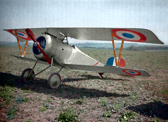
Since around 1912, the world’s Air Forces have been using symbols to identify their aircraft and vehicles. In my research, I discovered that this tradition started when the French military mandated that their planes be identified with a round insignia, or roundel, in the colors of the French flag. Needless to say, it took no time at all for other countries to follow suit.
During World War I, also called the Great War (1914-1918), the central powers of the Austro-Hungarian Empire, German Empire, Ottoman Empire, and the kingdom of Bulgaria all had planes that were painted with crosses. In contrast, the allied planes of Britain, France, Italy, Russia and the United States sported round insignia in the colors of their respective flags. Many of these same roundels are still sported on military aircraft today.
Over the years, these insignia have been periodically updated, or, as they say in the business world, rebranded. As a small business owner and graphic designer in Orange County, I can personally attest how important it is for businesses to rebrand in order to stay relevant in a world that is constantly changing.
![]()
For the United States, our round insignia started out with an outer red ring, middle blue ring and center white area. Unfortunately, this was too confusing, since there are several other countries with red, white and blue national colors. After World War I and through the earliest part of World War II, the USAF roundel was a blue field with a large white star sporting a red dot in the center.
As a notable feature of the American flag, it made perfect sense for our forces to sport an insignia with a white star on a blue field. In 1942, the central red dot was removed, and the USAF insignia became a round blue area with a white center star and bars on the side. Today’s USAF insignia is still the same, but with added stripes inside the bars.This powerful symbol is a stylized version of the U.S. Flag, and is very representative of America.
Sometimes, as in the case of the original USAF insignia, it ultimately takes a few revisions to create a strong logo that truly stands out. This instant recognition of a brand is what makes a strong insignia, and should be what every business aims to create when designing their own logo.