LESS IS MORE: WHAT HALLOWEEN AND HITCHCOCK CAN TEACH YOU ABOUT ADVERTISING
This month I have a treat for you!! A guest blog from the amazing blogger (and my best friend) Reina Victoria of A Dash of Gonzo!
It’s October, so ‘tis the season to get spooky. Yet there are so many lessons to be learned during Halloween, particularly for design. The basic goal of all advertising is to create a reaction, and that is often in emotions — in the case of Halloween, fear.
Yet the great master of Hollywood horror himself, Alfred Hitchcock, knew that fear wasn’t always in what you saw; rather, it was in small details and what you didn’t see; he built anticipation, making people psychologically invested in his project. Less, for Hitchcock, was always more.
We’re going to dig in with some of the best examples of Hitchcock’s approach. And since it is Halloween time, all of these will have a horror theme. Keep reading… if you dare…
USE OF COLOR
One of great imitators of Hitchcock was Steven Spielberg in Jaws, including the fact for most of the movie you never saw the shark (fun fact: this was because the mechanical shark, lovingly known as Bruce, kept malfunctioning and they had to figure out how to film without him). But for everything the master director has done, we’re going to focus on the iconic poster.
Every color comes with a feeling. Blue is usually a calm, tranquil color… until you notice there’s a giant dark shark in it that takes up a good chunk of the poster. The rest of the image with its light colors, right down to the swimming girl, is jarring in its innocence. There is only red in one place — the title, to attract attention. Yet the red is clever, because it tells you subconsciously about this film without saying outright, “Hey, this is a scary movie!”
FONTS
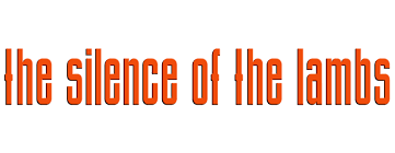
Most of the time, stereotypical Halloween fonts look like they’re either bloody or carved and can become clichéd very quickly. Yet look at the title fonts for two scary movies — Silence of the Lambs and Scream. These are clean and not stereotypical horror fonts, yet they send chills. And part of the reason is the letter spacing.
Look how close the letters are in The Silence of the Lambs are; they’re practically on top of each other, giving a claustrophobic feeling. Scream does the exact opposite — spacing out the white letters so far on top of black that you wonder what’s lurking between them. Either way, you wouldn’t recognize it unless you were looking for it, which was exactly what Hitchcock wanted.
SOUND
The Exorcist’s theme song is iconic yet utterly simple: tubular bells. Yet if you hear it, it’s shakes you. There’s something incredibly ominous about the tone, yet if you listen to it, you realize it is very minimal. Like the fonts, you’re looking for what’s hiding in the background.
William Freidkin, the film’s director, actually had the opportunity to use a different score. He decided against it, opting for not much more than the music you know from the movie. It’s almost inspired by Hitchcock, as Bernard Hermann’s famed Psycho theme was almost exclusively screeching violins. Instead of being a hummable melody, it is an accent to what is going on onscreen.
ANGLES
The way a camera points to capture a specific image or movement can often give you a feeling without anyone telling you what to feel in that exact moment. Close-ups, point of view, upward angles… all of these can give an psychologically ominous feeling.
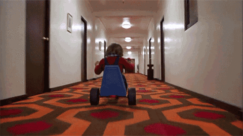
Take Stanley Kubrick’s The Shining, and its most famous scene of Danny riding the halls on his tricycle. We get point of view shots and upward angle tracking shots until we eventually meet the creepy sisters. We get close-ups and points of view from Danny, cutting quickly between them. Yet putting all the pieces together, we get an iconic and terrifying moment in cinema.
PUTTING IT ALL TOGETHER
Probably some of the best (and most terrifying) advertising done today is for the FX series American Horror Story. Every season has a theme — this year is “Cult” — and each one approaches its advertisements with a distinct visual style that is sure to shake you, from its posters to its online banners.
One tool the show uses is 30 second to one-minute teaser trailers. If you look at the one in “Cult,” it doesn’t really say much. And yet the sound of the clowns, the voiceover, swaying movements, the camera angles looking down on the action, the pops of color… it’s frightening. Yet it’s clearly not random; it makes you wonder what’s going on, and in turn want to tune in. And isn’t that what good advertising is all about?