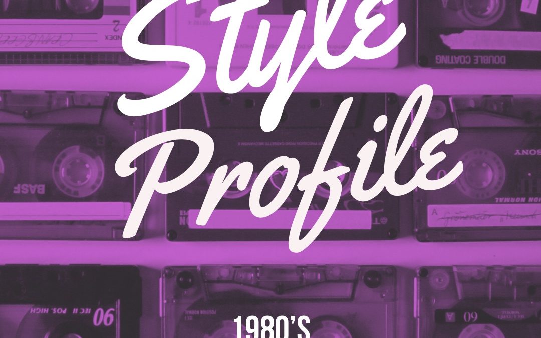
The 1980’s were a time of excess and change. The economy in America was booming, walls (both figurative and literal) were coming down. This was the height of the “Me Generation” where individual identity and capitalism reigned supreme. MTV was new and very popular, cassettes and vinyl records were the music listening formats du jour, personal computers were the hot new thing and everything was just bigger, brighter and looking toward the future. Design in this era was no different. Here we take a look at the big, bold, futuristic design style of the 1980s!
Characteristics
Colors:
Pastels, jewel tones, and neon bright hues. Top colors that were popular include sea foam green, mauve, black, bright cobalt blue and a floral like pink-purple. Colors are very saturated and bright
Type/Fonts:
Blocky type, tech/futuristic (8-bit) type, brush scripts, sans-serif
Notable design elements:
A very popular style was the Memphis Design Style that was named for the Memphis Group. This style includes bright colors, large geometric shapes, and a flat 2d look that have become part of the hallmarks of 1980s design.
Another notable design style is a futuristic style that includes lots of black, bright colors, gradients, sharp lines and symmetrical grids that evoke the feeling of computers and technology that was on the rise at the time.
Other notable elements include matched elements, farmhouse/shabby chic, incorporation of American flag motif or colors, and type effects such as neon light, mirrored, metal, and gradient styles to name a few.
Is this style trendy?
As of October 2018, the style of the 1980s is trendy. Brand leaders who are influencing design trends and calling the shots for advertising and design are creating visual styles for companies by finding inspiration in their 1980’s era youth. It provides these decision makers a feeling of freshness with its geometric patterns and script fonts while still providing a sense of nostalgia for these leaders who are in their late 30s and early 40s.
Why Use it?
This style is especially great for a brand whose target market grew up during this time period. It allows the business to call back a time of prosperity and appeal to the nostalgia of the community. Also, can be used if the business simply wants to be on trend for the current year.
When to Use it
If a brand doesn’t have a target market that grew up in the 1980s then use this style very sparingly. Best used for advertisements, flyers, or for a special 1980s themed event. Personally, I wouldn’t recommend it be used for a company logo unless the business is an 80’s themed brand.
How to Use it
The 1980s look is about contrast and excess. Mix elements that are opposite of each other and make things big. Remember more is better! For example, layer a pastel background with a large flat geometric pattern is a jewel tone and top the whole thing off with a brush script or use a background in black and layer on a symmetrical grid and use with blocky type in a neon color that also uses neon effects. It’s a really fun decade so make sure that playfulness and sense of fun come through!
Some examples:
-
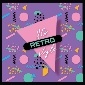
- 1980s Memphis Design Style in Pastels
-
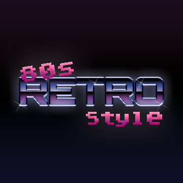
- Futuristic, Cyberpunk, Chrome and Neon Type