(Disclaimer: I have nothing to do with any of these organizations, I’m just a freelance graphic designer who happens to like their logos and felt they worked well for this article. Much of this article is based off of my perceptions and observations of the field in which I work)
Maybe your company has grown a lot recently. Perhaps you just don’t like the logo you had at first, it doesn’t fit your vision. You’re actually a lot more specialized than your old logo makes you out to be or you just inherited the family business and want to modernize it. There are many reasons to re-brand. Here are three different types of organizations who did that to mixed results.
Case # 1:
![]() I got taught in school that copying other people’s work is bad. Plagiarism is not something any of the designers I’ve met ever really wants to do. Most of us do at least some research when creating a logo for a client, which is part of the reason for the cost. Unfortunately, with so many millions of companies world-wide and certain themes being so popular, plagiarism can happen by accident. What one designer (or client) thinks is an inspired new idea can actually be something that looks uncomfortably similar to some one else’s work.
I got taught in school that copying other people’s work is bad. Plagiarism is not something any of the designers I’ve met ever really wants to do. Most of us do at least some research when creating a logo for a client, which is part of the reason for the cost. Unfortunately, with so many millions of companies world-wide and certain themes being so popular, plagiarism can happen by accident. What one designer (or client) thinks is an inspired new idea can actually be something that looks uncomfortably similar to some one else’s work.
Case in point: the Rio 2016 Olympics. Whether this was actually a case of accidental plagiarism or not and what the outcome should be is for the legal system to decide. For my purposes here, it is being used to show how easy it can be to copy someone else’s work even when the designer and client don’t intend to do so.
The Rio De Janeiro Olympic committee’s original logo when they were a candidate to be the host city was sleek and reminded a lot of people Brazil’s iconic Sugar Loaf mountain. Once Rio was selected as the official host city for the 2016 games, a new logo was commissioned as a final “Olympics 2016” logo. This new logo is modern, multicolored showing people dancing in a circle, most likely to indicate a theme like unity or friendship. If you look at it closely, you can make out the letters “R” I” “O” for Rio. Unfortunately, when this logo was revealed, it was quickly pointed out in many online communities that this new logo looked uncomfortably similar to a U.S. based non profits’ logo, albeit with some changes.
Case #2:
![]() Many times older companies like to rebrand often and in a subtle way as a means to keeping their image fresh to the public. Other times, older companies rebrand to separate themselves from an image and mode of operation that may seem outdated. I’ve noticed this type of re-branding seems to happen when there has been a big technology shift in a certain industry, a specific company has new leadership, a company or industry is recovering from some type of bad for business image issue, or is rolling out some type of expanded or new product line. Whatever the reason, when an older well established company rolls out a massive rebrand, people generally will notice.
Many times older companies like to rebrand often and in a subtle way as a means to keeping their image fresh to the public. Other times, older companies rebrand to separate themselves from an image and mode of operation that may seem outdated. I’ve noticed this type of re-branding seems to happen when there has been a big technology shift in a certain industry, a specific company has new leadership, a company or industry is recovering from some type of bad for business image issue, or is rolling out some type of expanded or new product line. Whatever the reason, when an older well established company rolls out a massive rebrand, people generally will notice.
Case in point: Southwest completed a rebrand in 2014. They changed their more intricate logo that featured the name of the company with a realistic drawing of one of their planes to a simple word mark featuring the name of the company with a little tri-colored heart that acts a nod back to their original logo. Air travel is a very competitive industry with a certain image that can provoke not always nice emotions. The easiest way for a company in this position to stand out among the competition and try to encourage more pleasant emotions is a rebrand. This is exactly what Southwest did. Using the heart symbol and a simple color palette of blue, red and orange across all of its branded documents and even new paint for their planes Southwest has quickly created an image for itself that stands out.
Case #3:
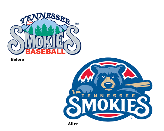 I see this type of rebrand a bit more often with companies that have a need to express a certain type of image—reliable, creative, tough, durable…etc. It also seems to come about when the old logo seems to have very little, if anything, to do with the industry that the company is in. Sometimes this shift occurs naturally as a company matures into one product line and customer base and out of another product line and customer base. Other times these shifts occur due to outside factors such as technology, government regulations, or competition among others. Sometimes the logo just misses the mark by being to too generic.
Case in Point: Sports teams typically have a certain image to them, which is one of the reasons they have tough sounding team names and mascots. At the very least the logo clearly indicates which sport the team plays. Minor League Baseball team, the Tennessee Smokies’ old logo had very little to do with baseball. In fact, when I found them during an online search I thought their old logo had something to do with a restaurant or store of some type. Then I saw the tiny little baseball tucked away behind the name of the team. Cut to their new logo, which has the look and feel of a team logo. The circular shape, the limited color palette, the bear mascot is holding a bat, the team name smack in the center under the mascot. One look and you just know they’re a baseball team.
If you feel your logo needs an overhaul or maybe just a little TLC—it might be time to rebrand! Contact Purple Rose Graphics to see how we help you create a shiny new logo to match your shiny new image.