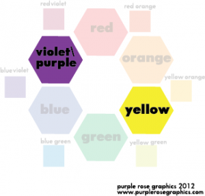
There are a lot different ways to combine colors into a palette or color scheme. We will only be covering a few of the basic ones. Picking a color scheme for your design is important because people look at items that have a pleasing, harmonious color scheme longer than items that have clashing colors. The first step in all of the methods of picking a color scheme is to first pick a dominant color. Got a color in mind? Great!
-ComplEmentary is often confused with ComplImentary (polite flattery, ex: “nice shirt”)
-Complementary means, “To make complete”
-Two colors are considered Complementary if they make a neutral color (gray, black, white) when mixed together
-Popularly used by many sports teams (i.e. Los Angeles Lakers, Denver Broncos, etc.)
-Complementary colors are visually pleasing and make each other look brighter (that’s one reason people enjoy the red and green associated with the Christmas season next to each other)
How to Create a Complementary Color Scheme
-Pick a dominant color (example: Purple)
-Go all the way across the color wheel and find its opposite (example: Purple’s opposite is yellow)
-Can use these two colors with white, black, gray (often in the form of silver) and brown

