When starting a business, the first thing most new business owners do is to pick out their new logo. This is your visual identity for your customers. You pick out a designer, tell them about your new company and what you like and want to see in your logo. After a few days or so you receive a proof, or draft, of your logo. Many designers give you anywhere from two to four options. Sometimes you get a chance to make changes, but some designers just have you pick the one you like as is.
So, how do you evaluate these logos to choose the best one for your business? Well, as a professional graphic designer in Orange County, California, I’ve seen hundreds, if not thousands, of logos! Here are the five tips I always tell my clients to help them evaluate their logo options and choose the best one for them.
#1. Uniqueness
It is vitally important that your logo design is unique. The design world has trends that make particular design features, such as “watercolor” brush script for 2016, more popular than in previous years. In addition to making your logo look more generic, using trendy design features also dates your logo. Have you ever seen a logo for a business and thought it looked so “ten years ago”, and not in a good way? Don’t be that company! Your logo needs to grow with you.
Also, you don’t necessarily want your logo to hit on certain obvious themes that are common in your industry. It can set up you to look more generic, and may also even cause legal issues. Having a unique logo ensures that you are not accused of plagiarism. Even though your designer may do research to help you achieve a unique logo, be proactive and educate yourself on the logos your competitors are using.
Lastly, a unique logo means your customers are more likely to remember you, and if they remember you chances are always better that they will hire you!
#2. Appropriateness
As I always tell my clients, you know your industry better than I do. Make sure the logo option you select is appropriate for your industry, your proposed customers and the cultures that your logo will encounter. Logos have to reflect your company’s personality and what you do with little to no text. Make sure to communicate with your designer and steer clear of any images, words, or phrases that could be considered offensive for what you do or the circles you’ll be interacting with.
#3. Balance
Choosing a logo is very subjective. The personal preferences of you and whatever team you might have will come into play when choosing a logo. I shy away from telling anyone what is a “good logo” or a “bad logo” for this reason. However, the one physical characteristic that I recommend is looking at the whole logo for balance. Your logo does not necessarily need to be perfectly centered, but every element in the composition should make sense.
 A balanced composition is not too crowded, nor has too much white space. The text should be plainly legible and all of the design elements should be spaced out well and complement each other; unlike my sample here, which has none of the above.
#4. Flexibility![]()
Logos should be flexible. They should work just as well in black and white (commonly called gray or gray scale) as they do in color. They should look nice on a dark colored background and a light colored background. If you have text with a symbol, make sure the two elements work well together and separately.
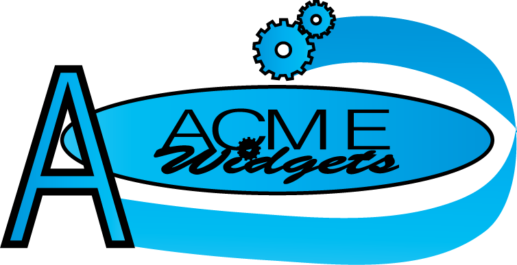
For example, the symbol can be used for patterns, as a background watermark, or other places where you might not need or want the text. The same standard goes for the text. Lastly, your logo should look good at any size, whether that be small enough for your business cards or large enough for your building’s exterior signage or a billboard. My sample here has a few of these elements depicted.
#5. You Love it!
I mentioned earlier that choosing a logo is a subjective endeavor. So, despite all the suggestions or rules you might hear, as the business owner you should love your logo! Choose the option that you can’t take your eyes off of and that makes you smile like you’ve just had a really good first date. If you get stuck between two options, figure out which parts of each option you really like and which parts you don’t like. You can refer to tips 1 to 4 for additional guidance and don’t be afraid to talk it through with your designer or with someone you trust.