 You’ve been staring at them since you first learned your alphabet. Letters! These little guys carry a big responsibility in your design. They are the main tools to convey your message from the sender (you) to the receiver (your clients).
Part of what graphic design is supposed to accomplish is to make this message look attractive so your customers will actually engage with your brand and read your message. That means choosing different type styles and sizes based on what you hope to accomplish with your piece. As a graphic designer in Orange County I get a lot of questions about type and fonts and letters. I’ve compiled three of the most common questions I get asked all the time about type.
What is the difference between a Font and a Typeface?
Fonts are the name for the entire set of letters whereas a typeface refers to the style of the letters themselves. Here is one of my favorite definitions. This comes from Will-Harris.com ” Typeface: is the design of the alphabet–the shape of the letters that make up the typestyle. So when you say “Arial” or “Goudy” you’re talking about a set of letters in a specific style. Font: is the digital file that contains/describes the typeface.”
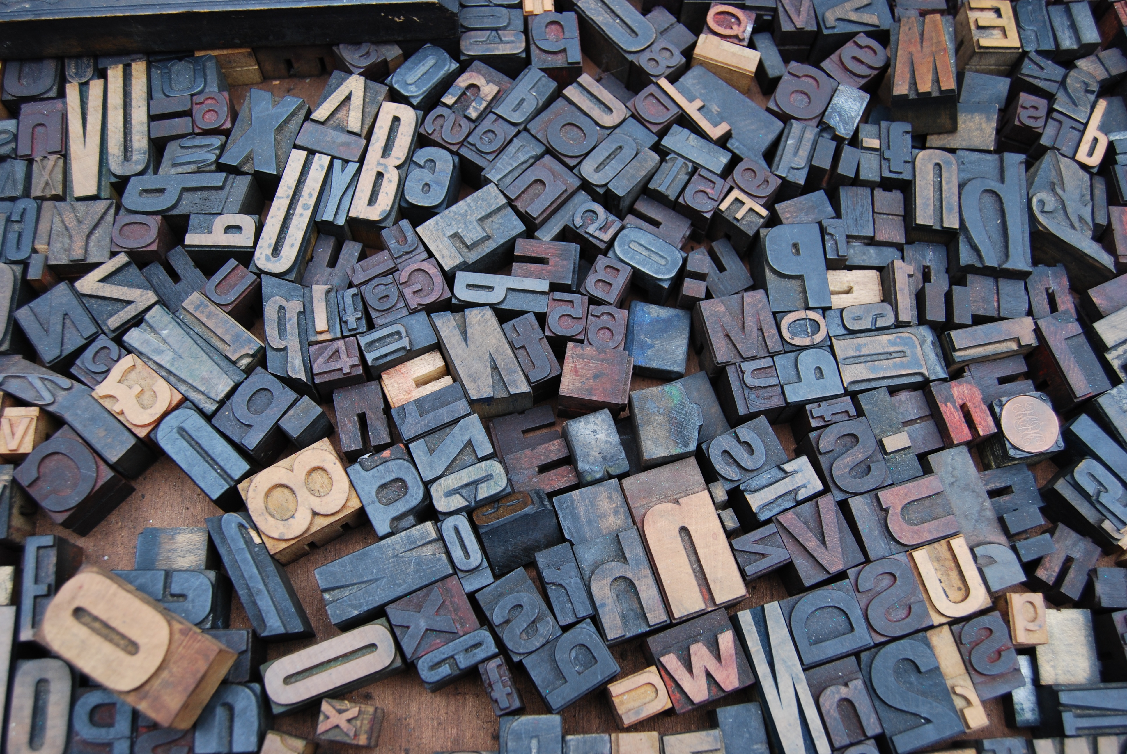
This all dates back to the time of the printing presses and manual type. When the printing presses first were being used, we were casting the letters in little blocks of metal, usually lead, to create type. There was a fixed amount of letters in each batch of type. The word font actually comes from the middle French word ‘fonte’ which refers to this process of casting type. Fonts carried a certain amount of letters or typefaces in them based on the frequency the letters would be used.
Are you still confused about the difference? That’s okay! Here’s a really simple, but silly, example for the difference: Soda (aka Pop) comes in small, medium, or large sizes. Each cup holds a set amount of drink in it. That’s the font. The flavor of the drink you get, cola, lemon lime, root beer etc. is the typeface. Saying Arial is a font is like saying, “I got a small cola” instead of saying “I got a cola flavored drink in a small cup”. Saying that Arial is the font is technically wrong. However, so many people do it (think Kleenex vs Tissues) that it frequently gets over looked and that’s why there is so much confusion.
Why do we call them Upper Case and Lower Case letters?
This also goes back to time of the printing presses. The press operator would put all the letters from each typeface in two cases. The capital letters were in the upper case and the small letters were in the lower case. So when the operator needed a specific letter he/she would be asked for it by referring to the letter needed and which case it was in! The terminology stuck and we now call all of our capital letters Upper Case Letters and our small letters are all called Lower Case Letters.
What’s the difference between a serif and a sans serif?
These words have roots in French and Middle Dutch. Let’s start with Serif. Serif started out as a Middle Dutch word “schreef” which means stroke, dash or line depending on which dictionary you use. By the 19th century the word schreef had morphed into serif the word we use today. It refers to the little dashes or feet on the ends of the letters. A good example of a serif type would be Times New Roman. Now for it’s counterpart, sans-serif. Sans is an Old French word with roots in Latin. It means “without”. So the combination of Sans (without) and Serif (dashes) means that this style of type doesn’t use any dashes or little feet at the ends of the letters. A good example of Sans Serif type would be Helvetica or Arial.
Hopefully, this helps shed some light on a few items about type that maybe you’ve always wanted to ask a graphic designer in Orange County, but were too afraid to ask! If you need help creating your next marketing piece just contact me! Let’s grow your business together-one design at a time!