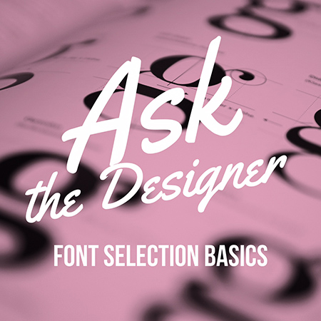
 As a graphic designer in Orange County, I get asked a lot about fonts & how to choose them. There is some technique to choosing fonts or type, but I’ve assembled a few tips to make the process a little easier. Here are some basics to get you started in being a font selection pro!
-aim for the target (market)
You must know who your customers are! Know the look they expect to see! Use fonts that appeal to the age & demographics of your customers. For example a bank’s customers expect to see something more formal & professional looking than customers of a daycare center would be looking to see. You can also choose type based on era. For example if you’re having a 1950s themed event, you can choose fonts that have a 1950s feel to them!
-keep it simple
When first starting out don’t clutter it up by choosing 6 different fonts! It looks disjointed & can be confusing!! Stick to 2-3 max!
-know your options
There are so many different font classes that I could (and will) devote a whole article to them! These include Serifs (like Times New Roman), Sans-Serifs (like Arial), Scripts (Edwardian Script) to name a few! It helps to know the classes of fonts because it keeps you focused when choosing a specific font!
-opposites attract
A chunky font with a skinny font look great together because they have different weights. The same goes for a script with a serif! Any time you have contrast you’ll have interest! So think about how you can create contrast by selecting different weights, heights, or styles.
I hope this helps make choosing fonts for your next project a little easier. If you still feel like it needs the touch of a pro, please feel free to contact me!