
The purpose of design is to help communicate information using visuals. As a graphic designer in Orange County, I can’t think of anything that would need to communicate information better than a map or diagram. It’s one of the best ways to help get hundreds of thousands of visitors from point A to point B. Today I’m going to tell you about the 1972 New York City Subway Map and what we can all learn from the situation.
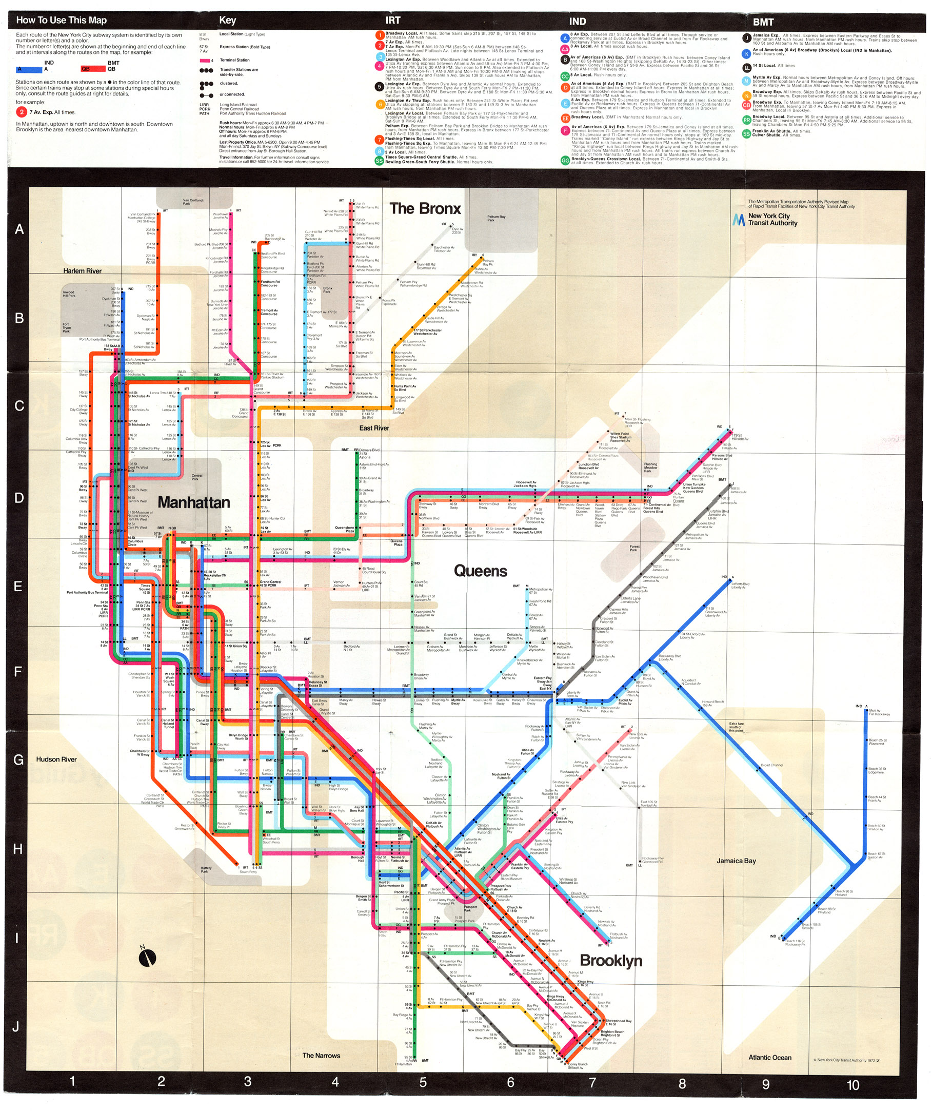
1972 NYC Subway Map / Image Credit to www.nycsubway.org
Our story stars in New York City, the 1964 World’s Fair brought an unexpected wave of over 50 thousand visitors to the city all trying to navigate a foreign subway system with mixed results. This led the Transit Authority to redesign the map and it was released in 1967. This map was better than what they had and used color-coding for the first time. However, in the early 1970’s when the Metropolitan Transit Authority was formed the new head of the agency, William J. Ronan, wanted a new more modern map of the subway system. Having been working with the design agency Unimark on other signage projects, Ronan asked them to also redesign their subway map to be more modern and solve the issues that had arisen from the 1967 version of the map.
I see these types of committees and presidents a lot as a graphic designer. Whenever someone takes over an established company and especially in the case of a merger. The new head, wants to make a statement. Often times, this statement is a total re-brand. The new map was Ronan’s big brand statement as the newly appointed head of the M.T.A.
The map redesign project was overseen by art director and designer; Massimo Vignelli. At this point in time, Vignelli was already an award-winning designer. He had come to the United States from his native Italy in the late 1960s to set up the New York branch of the Chicago based, Unimark International. The map created by Vignelli and his team was released in August of 1972. Eager to get the map out there, the M.T.A. skipped their usual field-testing with the general public and pushed the release of the map. This gamble did not pay off. The look of the map was very clean and modernist. It wasn’t really a map in the true sense of the word, but more of a diagram. It was based on the diagrams used in parts of Europe to explain the subway or underground trains systems there.
Without market research companies can’t address the issues that can sometimes arise for their customers. This is exactly what happened with the 1972 release of Vignelli’s modernist map/diagram. “The Vignelli Map” as it started being called shook the general public and was highly criticized. A majority of the criticism had to do with the fact that it wasn’t a true map and the topographical details typically found on maps wasn’t there or was distorted in some way. The general public didn’t like the water around the station stops was depicted in browns versus blues. They didn’t like that landmarks and open spaces were incorrectly sized. The public also didn’t like the inaccurate placement of stations and rail stops in an effort to streamline stations. This map, wasn’t a little hand-held pamphlet either, it was wall signage and large posters that went up at different points in the subway system.
In this case, the design team was up against a challenge. On one hand, they needed to simplify the confusing maze-like subway system into something legible. This is especially true since the New York subway system, at the time, was very confusing as it was the product of a merger of three different companies’ stations and rail lines. On the other hand, they need something the general public and the out of town travellers that the map was meant for want to use it and feel they can understand.
Two additional factors that I feel led to the eventual discontinuation of the Vignelli map were that it was part of a series of four maps, with only one being released and the other is that is was called a map versus a diagram and the public was expecting something different than what was released.
The Original Vignelli Map was used from 1972 until 1979. In 1979, a new map redesigned by a different designer was released. After a series of redesigns, Vignelli and his team were invited back to design a newer updated version of their iconic map in 2008. A few years later to create an interactive version of their map called the Weekender. Vignelli agreed to creating the Weekender on the condition that all of the parks and topography were removed and that it was called a diagram versus a map. M.T.A. agreed on these conditions and it was released in 2011 and as of 2015 was still in use.
This situation illustrates how design can make or break something. The design of the diagram was good and easy to read as long as the user was expecting a diagram. However, the riders were expecting a map and were trying to orient themselves with topography, which a diagram isn’t going to help them do. This led to the project being considered ‘flawed’ and was replaced. It also shows how important it is to follow the design and marketing process and to not skip steps. Skipping steps and rushing to release a project can lead to total crash of the project because there isn’t time to smooth out the major flaws or bugs in the project.
Hopefully, you learned a little something interesting and if you need help using visuals to communicate to your audience, contact me!